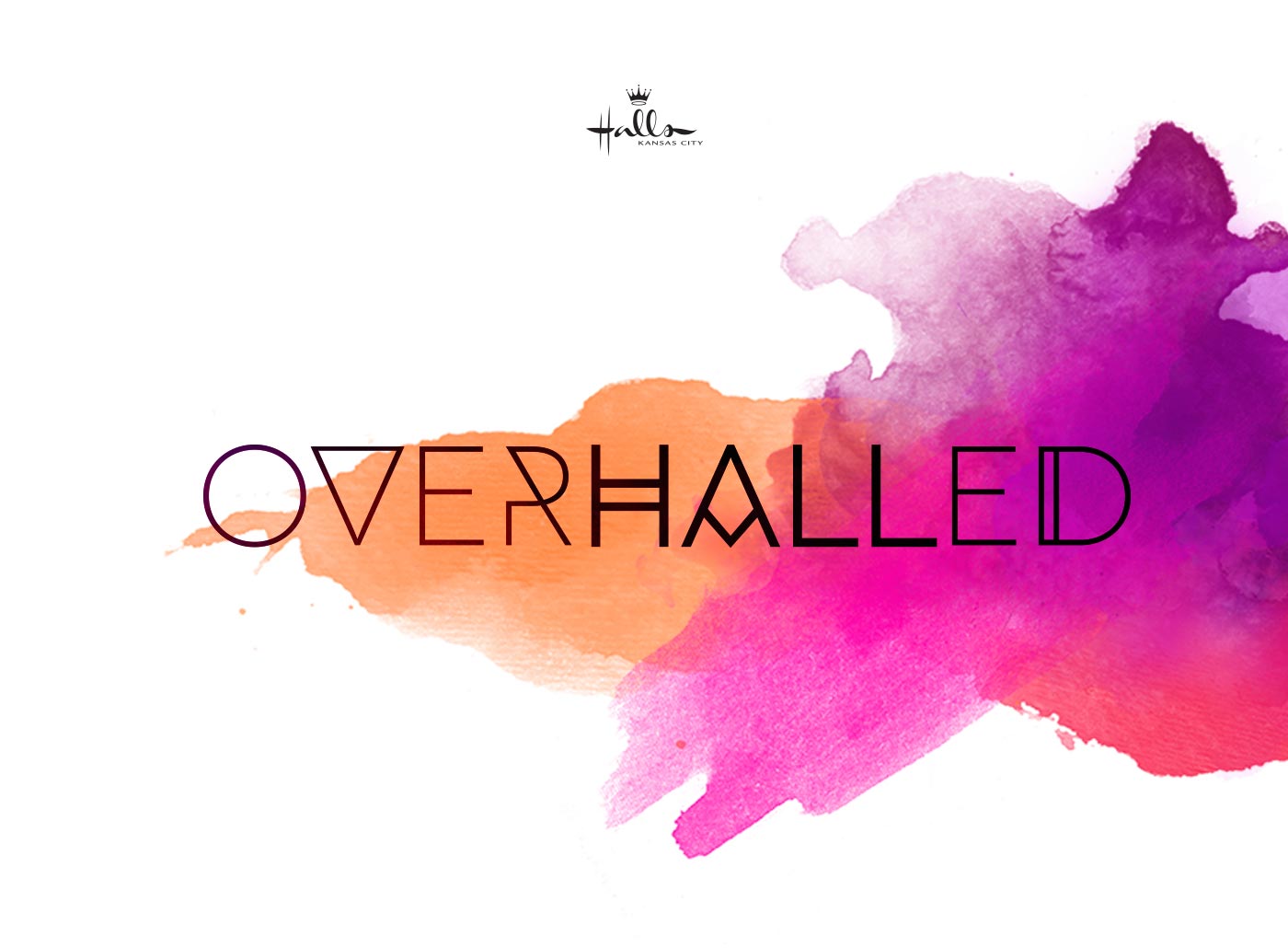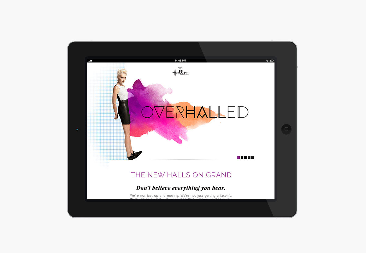


Halls Kansas City was in the middle of an ‘overhall’ and needed to promote their new brand while the store was still under construction. A simple nod to the novelty of The New Halls on Grand, this campaign’s emphasis is on change. Change not only for Halls, but also for its consumer.
I created a custom logotype for the campaign and used the pantone color of the year (radiant orchid – 2014) as the anchor color to give the project a fresh, fashionable feel.
The responsive, one page site was designed with the goal of keeping interest in the Halls Brand alive while the store was closed for construction, and helped drive traffic to their various social media channels with the help of the #overhalled hashtag campaign and $1,000 shopping spree giveaway.
You can visit the site here
- HTML/CSS
- PHP/Wordpress
- UI/UX